BLOG
Why Development Teams Need Design Systems
In today’s hyper-competitive marketplace, research has shown that a pleasing and attractive design doesn’t just make the product look good, but also delivers real business value.
An attractive user interface and an excellent user experience, have gone from “nice to haves” to “must haves.” This article will explore how UI/UX practices and expectations have evolved in recent years, and explore how these changing requirements can best be met with a dedicated design system.
What Are UI and UX?
UI and UX are two distinct yet often conflated terms in the field of product design.
The user interface (UI) is the space in which users interact with a product or technology. Graphical user interfaces (GUIs), which are used for the vast majority of software and mobile applications, are visual layouts with a graphical representation of the user’s possible interactions-think of components like drop-down menus, buttons, sliders, and text entry fields.
A product’s UI is just one factor that goes into its holistic user experience (UX). The UX of a product describes the user’s overall emotions and sentiments while using that product. These can be broadly positive or negative, as well as more specific feelings:
- Are interactions with the product clunky or smooth?
- Is there a logical flow to how users are expected to use the product?
- Is it easy for users to see how to perform a desired task?
While UI and UX are related, they’re by no means the same thing. A product that’s pretty to look at but hard to use will have a great UI but terrible UX. The reverse is also possible, although more rare; just think of popular websites like Craigslist that have a bare-bones interface.
Both UI and UX have an impact on users’ initial willingness to try a product and their desire to keep using it. Excellent UI/UX design is crucial in order to capture and maintain engagement from your audience.
UI/UX in Today’s Digital World
Best practices in UI and UX are constantly evolving to meet the changes in the underlying technologies.
For example, many UI/UX practitioners are now taking a mobile-first approach to web design. November 2016 was the first month in history when mobile devices were used more than desktop computers to browse the web, and since then mobile’s share of web traffic has continued to increase.
This means that designers need to consider the limitations and differences that impact users of mobile devices. Smartphones and tablets have dozens of possible screen sizes, and the design you choose needs to look good on all of them (a concern known as responsive design). By designing for the smallest screen first, you can ensure that your UI makes effective use of the available space and isn’t too cumbersome to navigate.
Adobe has created a helpful 7-step guide to UI/UX for different screens and devices that should be recommended reading for all designers.
Modern UI/UX design should also accommodate the new ways that people consume information on different devices. In particular, your UI must avoid information overload to avoid confusion and user error.
Designing Excellent UI/UX with a Design System
Users today expect more from their products and experiences than ever before. Developers and designers need to create high-quality, attractive web, mobile, and software applications, all while maintaining a consistent UI/UX and branding.
However, this ideal often runs aground when faced with real-world challenges. Poor communication between designers and developers can lead to UI/UX inconsistencies and duplicated work. Maintaining the interface becomes more and more complex as time goes by and as team members join and depart the project.
To solve these problems, many UI/UX designers are making use of design systems. A design system is a platform that serves as a “single version of the truth” for all of your UI/UX design. It collects UI components in a centralized location, and establishes a shared design language, standards, and philosophy for all members of the team.
The notion of a design system borrows from the methodology of atomic design. This philosophy suggests that good UI/UX should have elemental building blocks that can be composed in a modular fashion into larger patterns and templates.
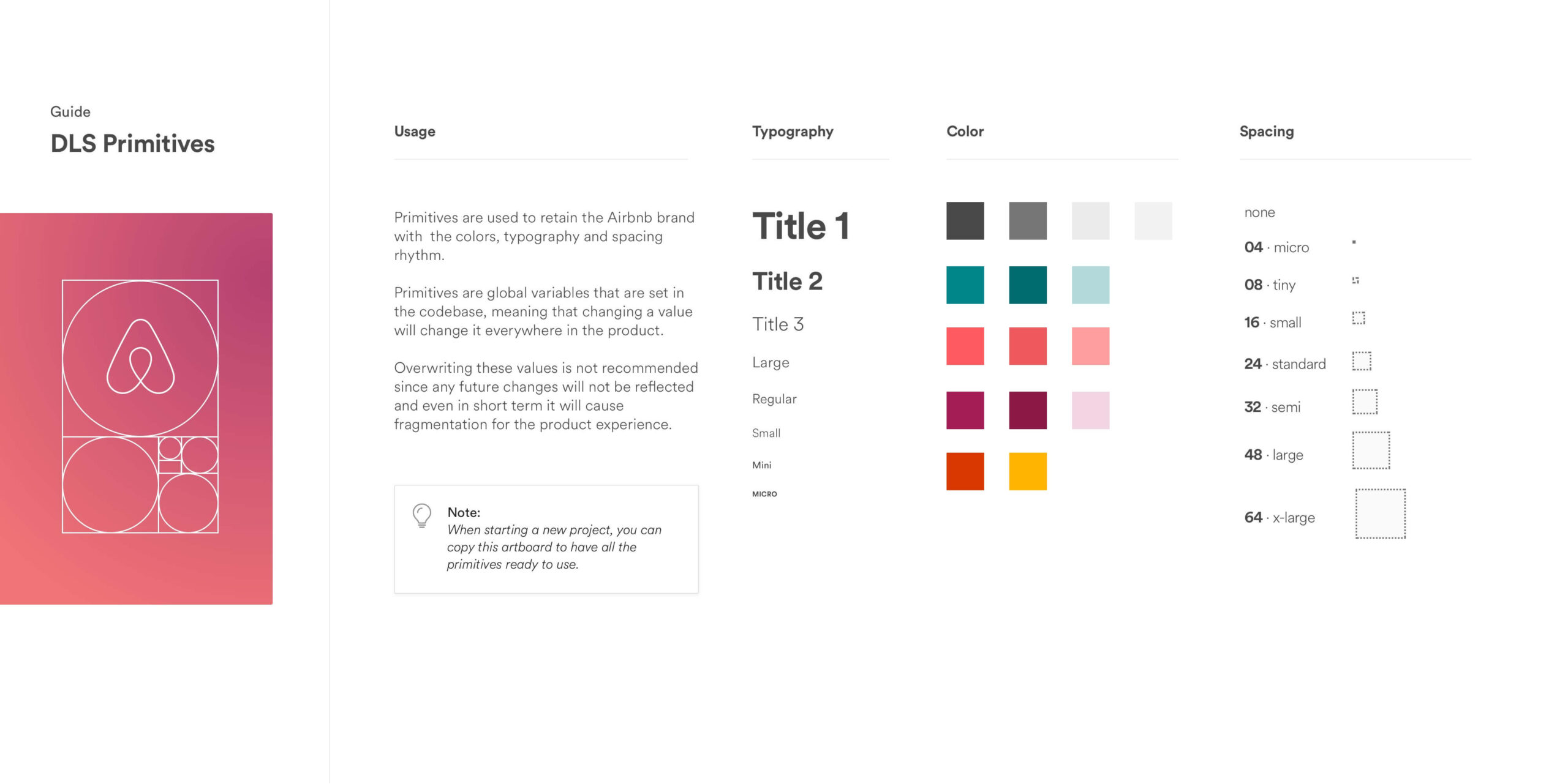
Depending on the use case, design systems may contain information such as:
- Color schemes
- Photographs, logos, icons, and illustrations
- Typographic information like font families, sizes, and styling
- User interface components like buttons, forms, and dropdown menus
The benefits of a design system include:
- Scalability: Collecting this information under one roof makes it much easier to scale a product later on, to expand a product to different platforms and devices, and to develop multiple products with the same UI/UX.
- Collaboration: Design systems make it drastically easier for all members of the team-designers, developers, product managers, and marketers-to collaborate and share resources. Storing your design assets in a single location ensures that everyone has access to the most up-to-date versions of the files they need to excel at their jobs.
Many companies have published aspects of their design system online. The Lonely Planet Style Guide is a good example of a solid, informative design system. Lonely Planet’s design system describes the company’s primary and secondary color palettes, icons, typography, UI components, JavaScript code snippets, and more.
Design as a Key Part of Development
Here at Very, we treat UI/UX design as an integral part of the development process. From the beginning of the project, we work with our clients to build exceptional user-centric products and interfaces that best fit their needs and objectives. We can bring your idea from prototype to finished product, or perform a much-needed design refresh for an existing product.
Want to learn more about our approach to product design? Get in touch with our team today to see how we can help.


