BLOG
Deliver Ongoing Value by Preventing IoT App Fatigue
Nearly every Internet of Things (IoT) device ships with a companion mobile app. These applications are often integral to the product’s functionality, like a wearable device that provides a dashboard where users can view the sensor data it collects, or an app that enables users to remotely control the device. However, there’s also a class of IoT devices that really only have mobile apps for one reason: because everyone else’s devices have them.
What we often find is that this leads to a conflict between a product’s developers and its users, a conflict that ultimately leads to lower levels of adoption and a smaller market share. Apps need to provide quick and clear value to users, and an app that doesn’t do this can be a distraction.
People are willing to download and use an app if it provides genuine value, but if the upside is small or marginal, then downloading an app, creating another password-protected account, and using that app on a daily basis becomes much more of a chore than anything else. And that’s the opposite effect of what a smart device is supposed to have.
What’s going on and how can smart developers address it?
The Challenge: IoT App Fatigue
“Do I really need to download another app for this thing?”
If you’ve ever had this thought or felt something along these lines, then you’ve experienced app fatigue. James Calder at IoT for All defines it succinctly as “having too many apps in your life,” and this well-documented phenomenon is especially prevalent for IoT use cases like smart homes.
Stacey Higginbotham writes on her blog,
As I settle into my new home, placing sensors and gear throughout, I’m weary of the digital clutter that takes up space, both physically and virtually.”
Even as a smart home enthusiast, Stacey finds herself asking why she has to download and use a dedicated app for even the simplest of tasks, such as heating up a coffee mug.

This is an issue because any mobile app, even ones with minimal functionality, ask for a piece of our limited attention. Between remembering yet another password, an overabundance of notifications, and having to depend on an app just to get the thing to work, IoT app fatigue can cause a connected device to be less attractive than a traditional counterpart-certainly not a winning formula for a more expensive alternative.
Customers buy devices that are connected to the internet because they want them to make their lives easier. They want more convenience or safety, and they’re willing to make the investment because the device promises to free up time for what actually matters: spending time with family and friends, pursuing passions, and all the other things that make us human.
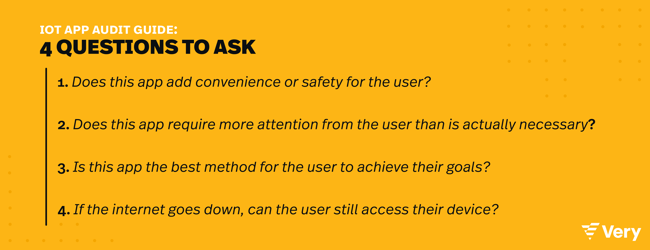
It shouldn’t be the other way around. Taking this to the extreme, Amber Case, author of Calm Technology, warns us about what she called “The Dystopian Kitchen of the Future,” a smart home setup that ostensibly makes our lives easier by taking care of chores like ordering groceries via a smart fridge. When that same fridge won’t open when the internet goes out or we forget the password to our IoT toaster, it starts to look like more trouble than it’s worth.
Case urges us to ask ourselves,
Why should I have to be a system administrator to live in my own house?”
How Calm Design Alleviates App Fatigue
The solution isn’t to throw the baby away with the bathwater and turn away from the benefits of IoT technology. Technology’s most destructive consequences are not a direct result of the tech itself, but rather how we implement it. As computers become increasingly ubiquitous—at home, at work, in the car, etc.—we need a keen awareness of how to design our products so that they actually fulfill tech’s greatest promise: making our lives better.
That’s why I advocate for calm design, a type of information technology where the interaction between the technology and its user is designed to occur in the user’s periphery rather than constantly at the center of attention.

This term was coined by John Seely Brown and Mark Weiser in 1995. The latter explained that “the most profound technologies are the ones that disappear. They weave themselves into the fabric of everyday life until they are indistinguishable.”
In a paper published in 1996, Weiser goes on to state, “When computers are all around, so that we want to compute while doing something else and have more time to be more fully human, we must radically rethink the goals, context, and technology of the computer and all the other technology crowding into our lives. Calmness is a fundamental challenge for all technological design.”
These are the principles of calm design:
- Technology should require the smallest possible amount of attention.
- Technology should inform and create calm.
- Technology should make use of the periphery.
- Technology should amplify the best of tech and the best of humanity.
- Technology can communicate, but it doesn’t need to speak.
- Technology should work even when it fails.
- The right amount of technology is the minimum needed to solve a problem.
- Technology should respect social norms.
Looking at this specifically within the context of whether an IoT device should have a mobile app, think about how to push the user interaction to the periphery of their attention. This could mean integrating more functionality into the device itself, using cues like indicator lights or haptic responses, or playing a nice song when the rice is done cooking instead of using an annoying buzzer or pinging the user with another notification.
As Case puts it, “Calm tech allows people to accomplish the same goals with the least amount of mental cost.”
Let’s look at some examples. The Caspar Glow Light may still have a mobile app, but 90% of its functionality is outside the app. IoT sensors automatically dim the lights at night and brighten them in the morning.
Users can also perform actions on the device itself, such as twisting it to change the brightness or wiggle it for a low, gentle nightlight. The app adds features like scheduling a wake-up time, but it’s certainly possible to use the light without even downloading the app.
Another good example is the tornadoAlert. Most of the time, this device sits in the background, not asking anything of its user while simultaneously monitoring for tornadoes in the area. When it needs to get the user’s attention, it makes a sound—no need to send a notification to a cellphone.
In this way, this device is similar to the alert system in a car. Most of the time we don’t need to think about our car’s status, but when the check engine light comes on, that’s when we want our awareness to crossover from peripheral to immediate. We can then take our car to the shop.
Final Thoughts: To App or Not to App?
The real key to understanding whether or not an IoT product should have an app and how much functionality should live inside that app comes down to purpose. Is an app absolutely necessary to make the device do what it needs to do?
Take some time to explore alternatives. If the product includes a screen, then it’s easy to embed much of the UI right there. Otherwise, look into other ways that the user could interface with it.
Maybe the device has buttons and makes sound. Maybe it includes a sensor that gathers valuable but not-so-urgent IoT data—could we send the user a daily email or text message instead?
Another potential game-changer is the introduction of Apple’s App Clips. It is a new way to experience an app without having to install a full application. If your product has only a small set of interactions and tasks, users can complete single tasks quickly and effectively.
By getting creative, exploring the purpose behind the technology, and leveraging the principles of calm design, we can work together to end what Case calls “the era of interruptive technology.” Tech works for us, not the other way around.


